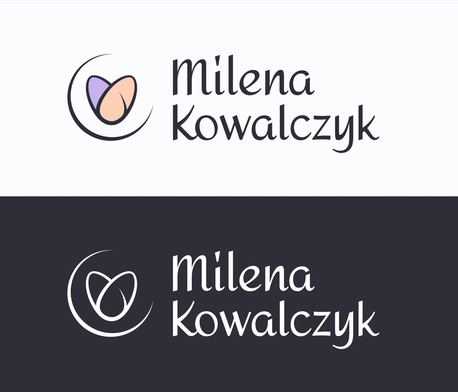
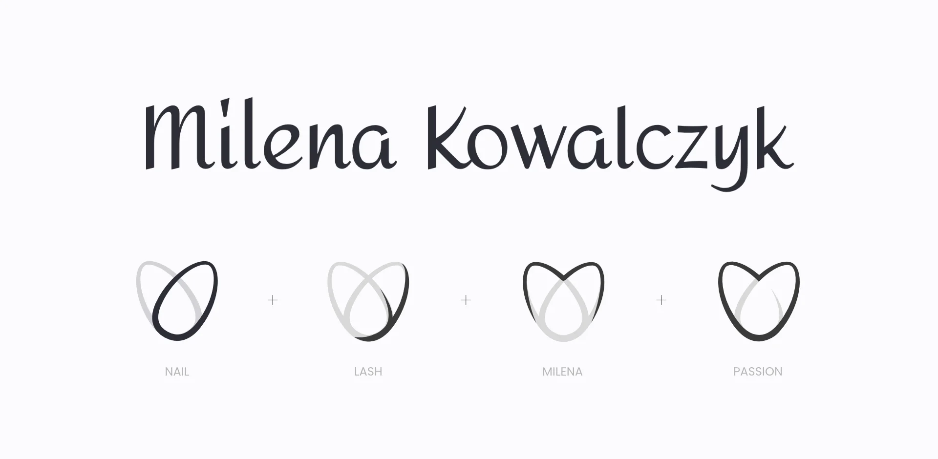
The main logo consists of a word-mark accompanied by an icon. The word-mark is a customized version of the 'Amita' font.
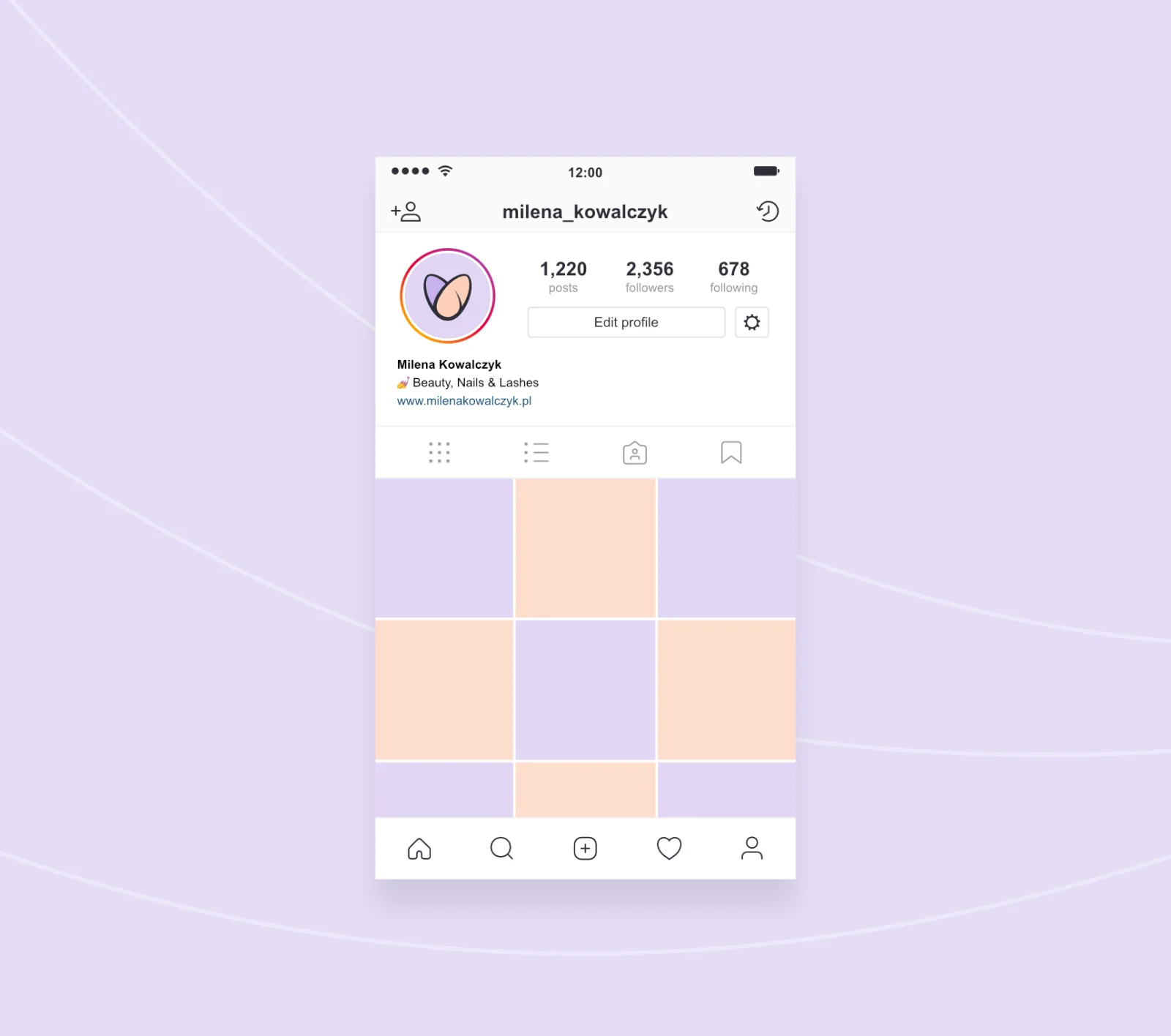
Here's one of many mockups I prepare while communicating with the client. Most of the time the true strength of the logotype becomes clearly visible when placed in an environment that that logotype is supposed to exist in. In this case, social media was a big advertisement source for the client, so some mockups of the Instagram profile were suitable.
As the client has two distinct presences online that she does not want to merge into one. One is a logo for the business and one is a personal one that the client uses when attending workshops and beauty conferences. Those sisterly logos work together in tandem.
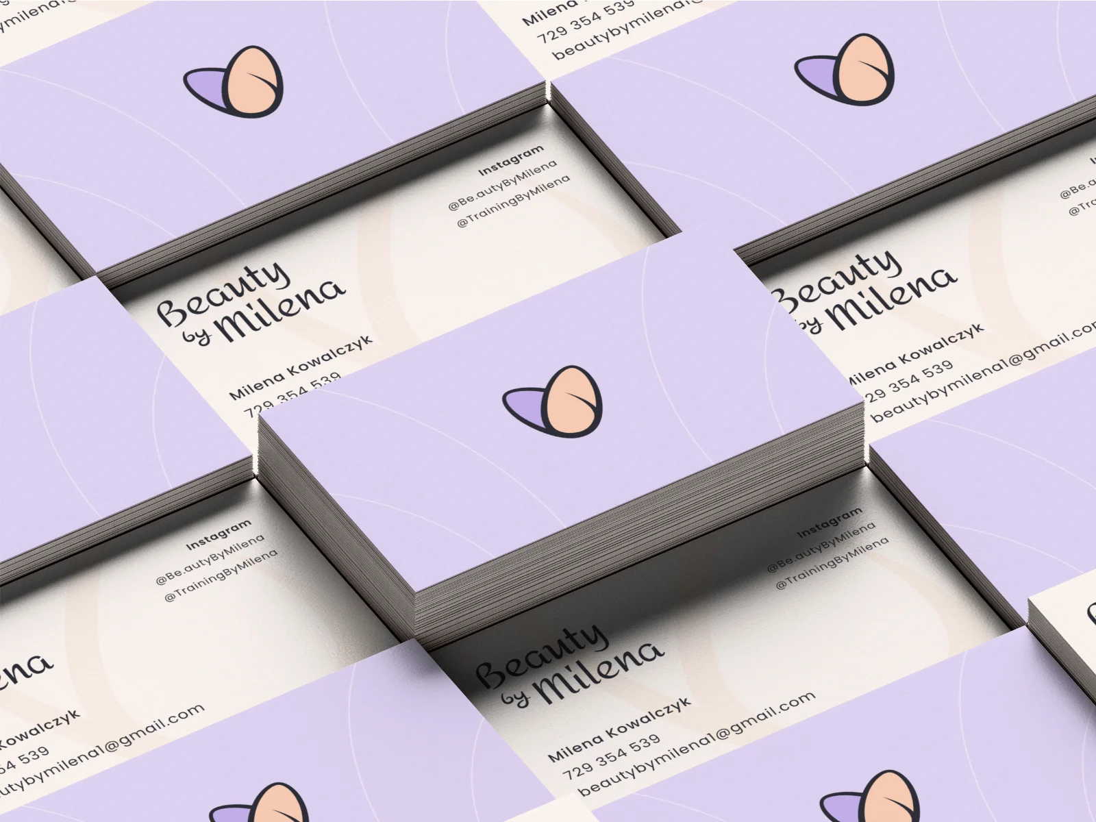
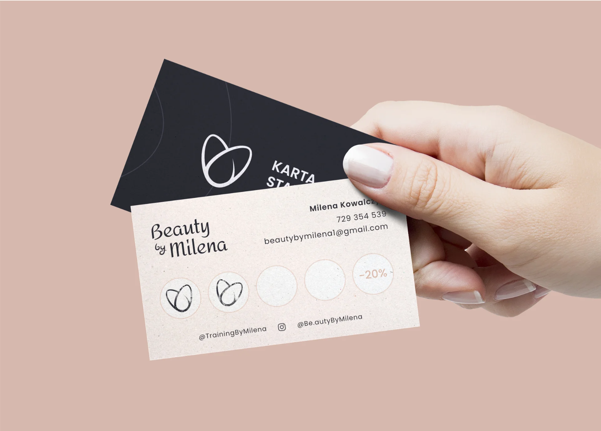
After the work on brand identification was done. I moved on to the next request, which was creating additional brand materials. Those included a banner, a certificate template, a business card, and a loyalty card.
