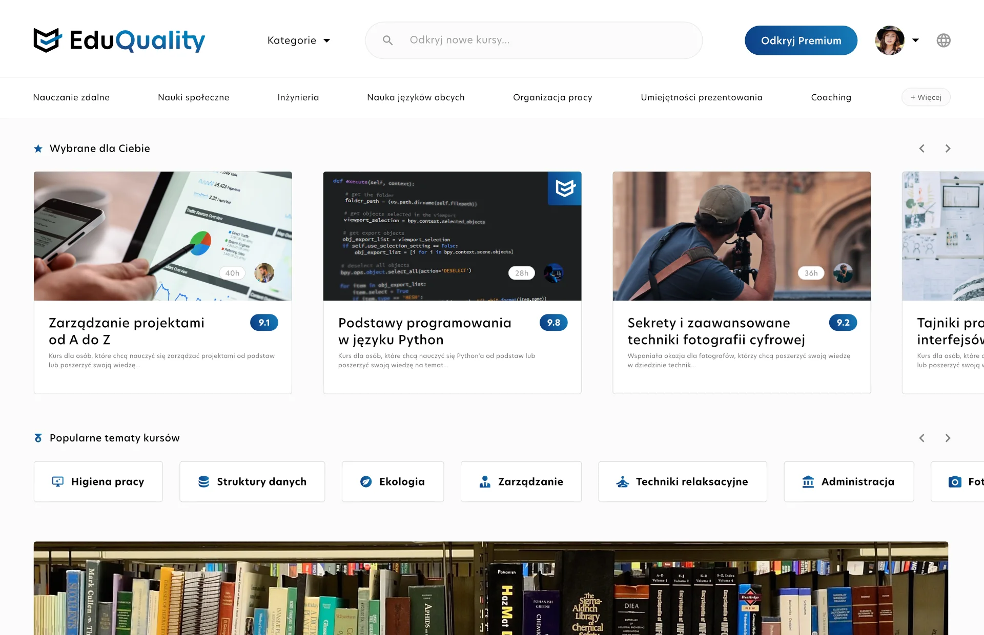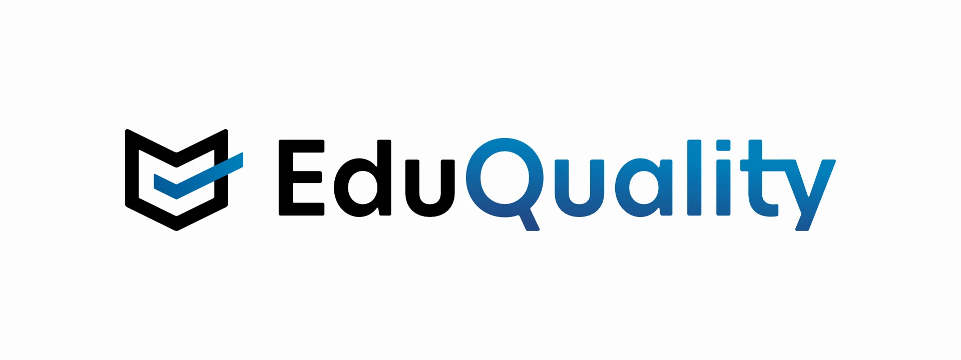

There are three main logo versions. The primary one consists of the word-mark and the icon. Both of them can also be displayed on their own. Suitable safe zones for logo placement have been described in the logo book alongside other guidelines.
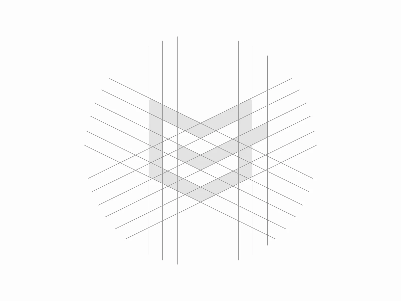
The structure of the icon is based on a book, the symbol of education, and a checkmark indicating the quality. The colors of both of the elements are also reflected in the work-mark, where colors correspond with those two values.
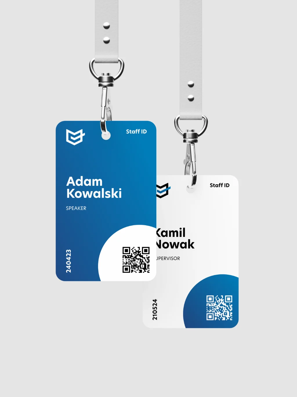
Mockups are an essential part of a designer's portfolio. Finding mockups that work for you and maintaining a collection of them can be a great way to quickly create visuals that help convey the message of the brand.


As per the client's request, an additional visual has been created. This stamp graphic is meant to be an additional design element that can be used in some of the promotional materials. There are two versions of this stamp, with and without texture.
